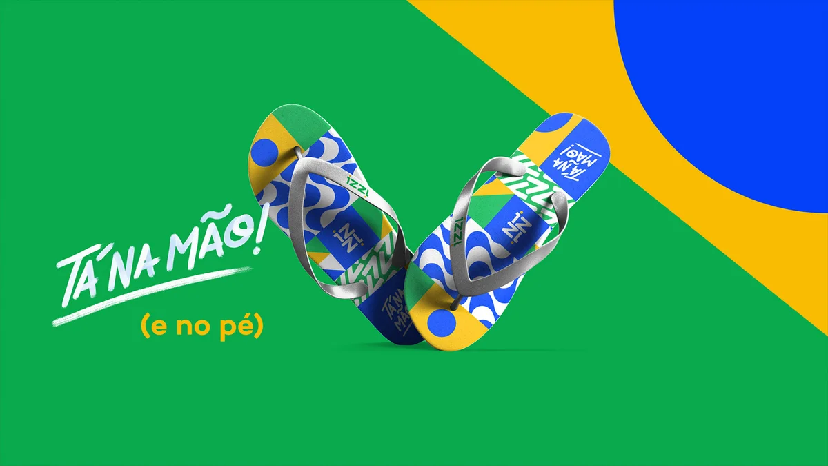
A manifesto transformed into samba: a super friendly and versatile identity, just like the Brazilian people
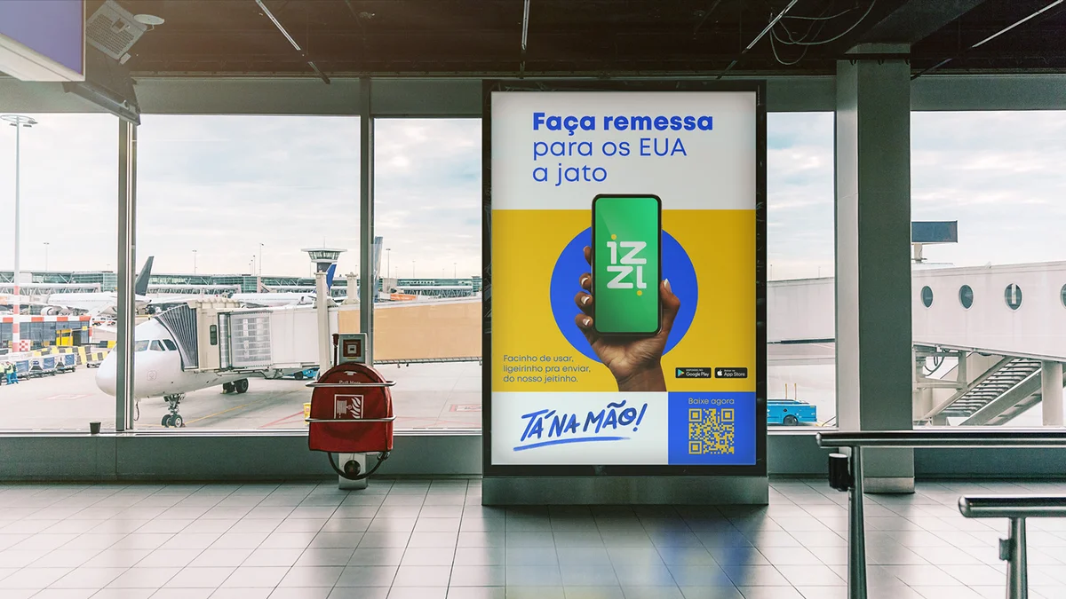
Branding for an international transfer app focused on the Brazilian public
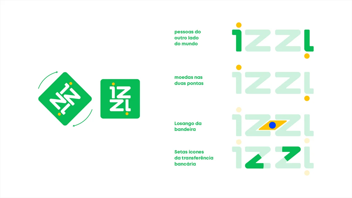
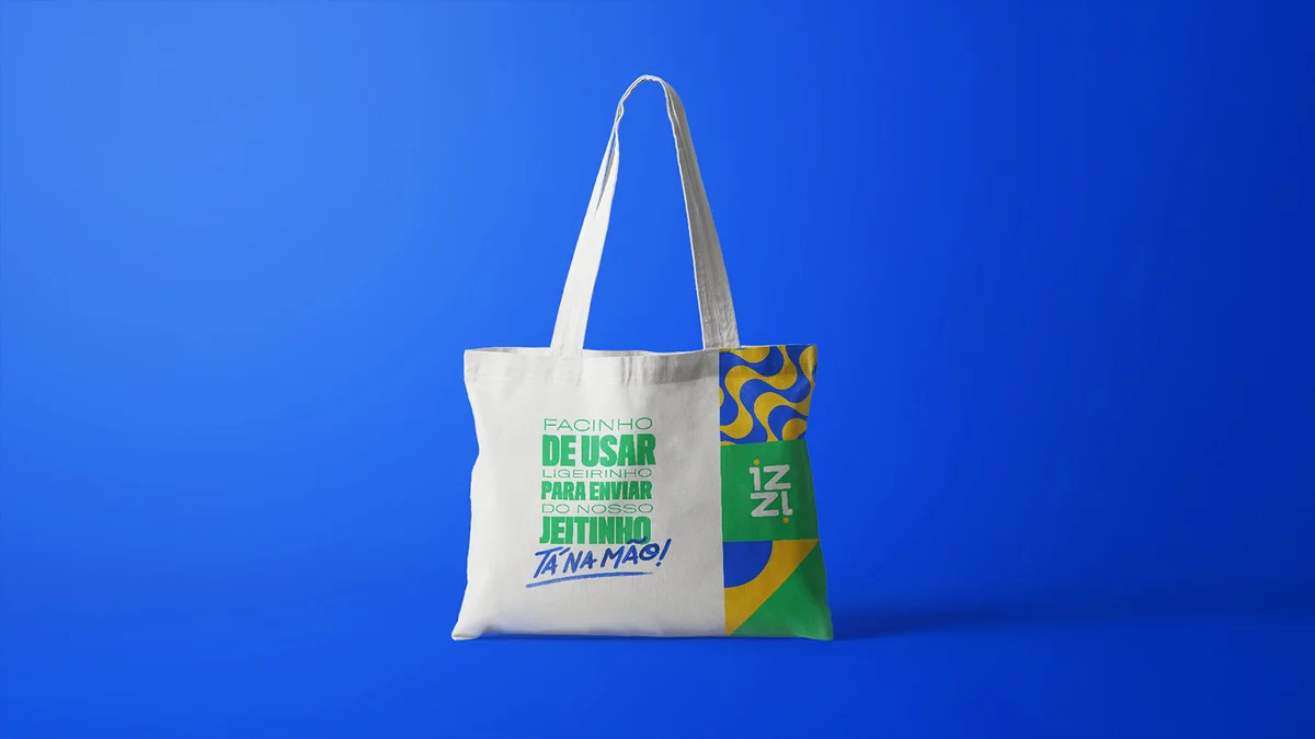
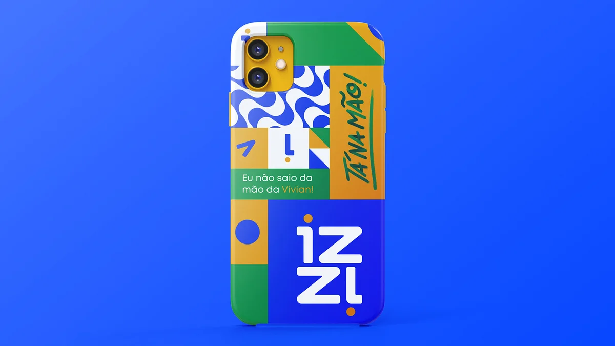
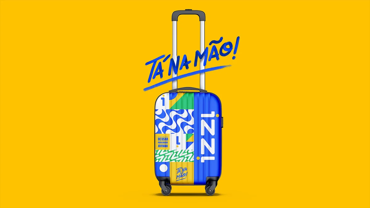
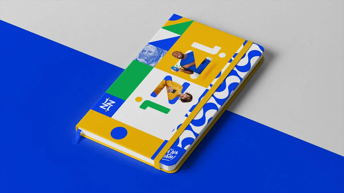
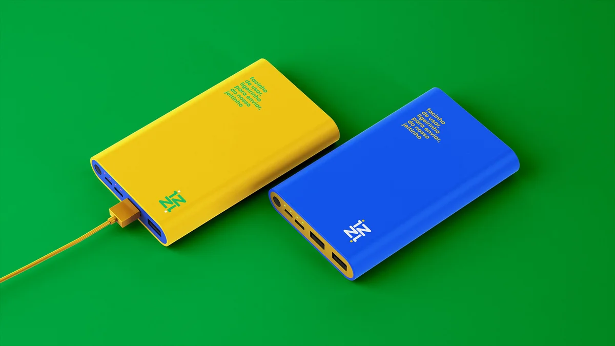
IZZI's language and identity are reminiscent of Brazilianness since, unlike its competitors, it is an app created by Brazilians for other Brazilians. From the smallest details, IZZI is a new experience for those who need to send and receive international payments in a more accessible, cheaper, and faster way.
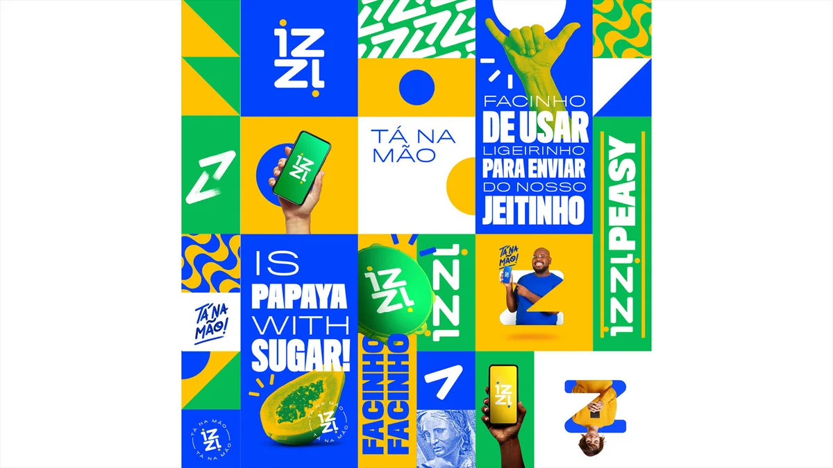
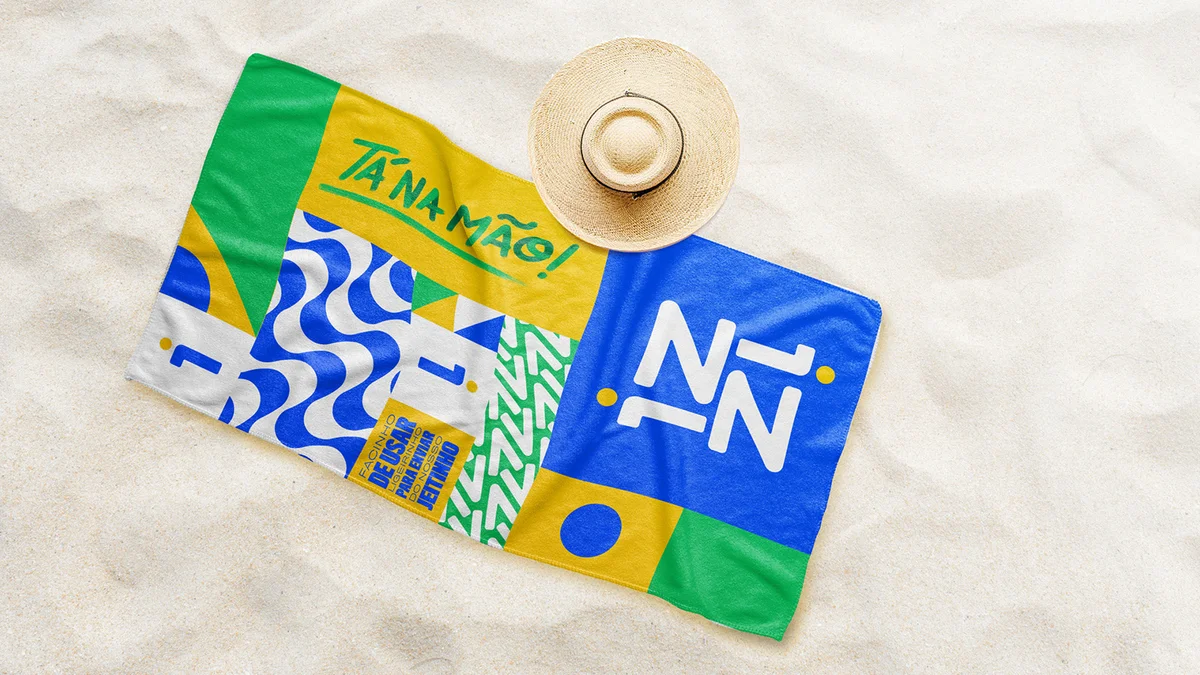
The brand was created to highlight the main symbols of Brazil and try to get closer to the public by using this language in the simplest and most poetic way possible. In addition to art direction, I worked on several advertising pieces for various media, including TV and out-of-home media.


Project
Outcome
Key Points
I worked on branding an international money remittance app that aims to serve the Brazilian public. For this, icons of Brazil, such as colors and sounds, and the cheerful and optimistic vibe of the Brazilian people were used in the identity, all without losing strength and simplicity.
What I Learned
The biggest challenge in building any brand is translating the central concept of a brand as simply as possible, no matter how complex it is. This becomes even more difficult when the idea to be conveyed is cultural. I loved the challenge and the result!